

Spruce
Optimizing Money Movement: A UX Redesign for Real Estate Transactions
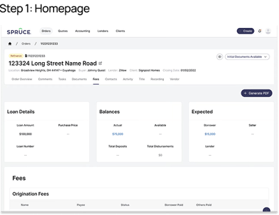
Spruce is a title and escrow company that manages the backend of real estate transactions through its internal platform, Pinecone. When rising interest rates slowed the market in Fall 2022, Spruce needed to maintain speed and accuracy with a leaner team.
I led the research and redesign of Pinecone’s Fees and Escrow workflow—a critical part of the system where inefficiencies were causing slowdowns, errors, and increased risk.
Date
Role
UX Researcher
About the Project
September 2022 to December 2022
Stakeholders
COO, Director of Funding, Engineering Leadership, Design Manager, Lead Product Manager, Product Manager, Product Designer
Methodology
Contextual Inquiries
Remote Moderated Usability Testing
Introduction
With transaction volume dropping and fewer staff on hand, Spruce leadership flagged the Fees and Escrow experience as a top operational risk. This part of the system handled the flow of money—from fee creation to final disbursement—but was split across three roles and three disconnected pages.
Business Case
Research Approach
01
The business needed to:
✅ Reduce manual errors and audit risk
✅ Shorten transaction time to avoid revenue loss
✅ Scale the operation without increasing headcount
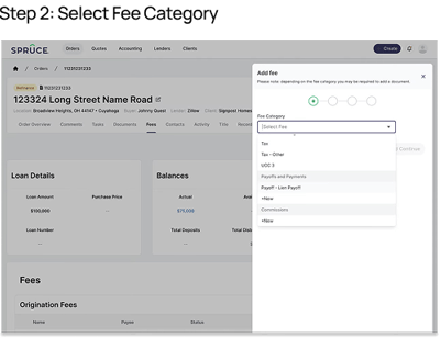
To meet these goals, the team prioritized a complete redesign of the experience. The aim was to consolidate workflows, add key functionality (like bulk disbursement and document-linked fees), and simplify the interface—helping users move faster while staying compliant.
Observed 15 sessions across Closing, Pre-Funding, and Funding roles.
Documented workflows, repeated steps, and user workarounds.
Delivered personas, task analyses, and a usability issue spreadsheet.


Phase 1 → Contextual Inquiries

Phase 2 → Iterative Usability Testing
Moderated weekly tests over 4 weeks using live prototypes.
Measured task time, error rate, SEQ, and SUS.
Each round informed weekly design changes and stakeholder decisions.
02
Contextual Inquiries
How We Studied the Old System
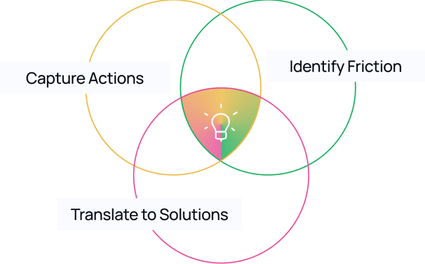
Observed users working inside Fees and Escrow to capture real actions and thought processes.

What
Why
Identify broken workflows and pain points that wouldn’t surface in interviews or surveys.
How
15 remote one-hour sessions with Closing, Pre-Funding, and Funding Associates via Google Meet.
Deliverables
Prioritized usability issue spreadsheet, task analysis across roles, and a user persona summary.
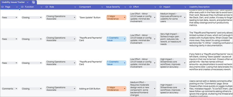
Usability Issues Tracker
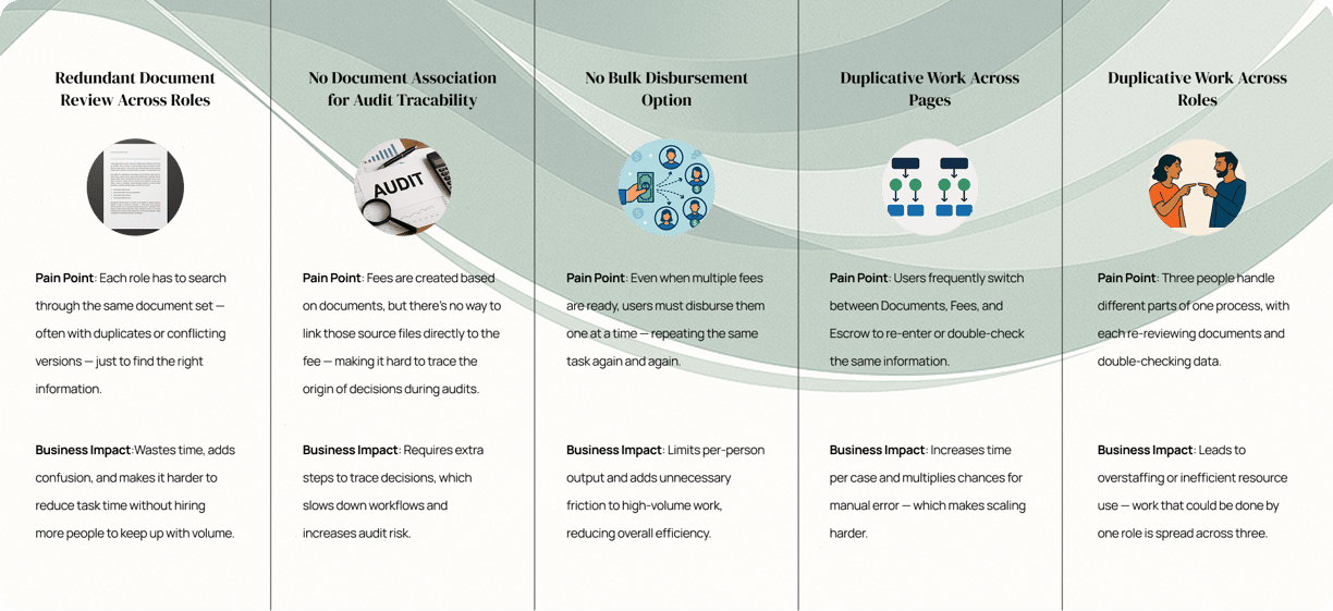
This tracker was created to document and prioritize the usability issues uncovered during the contextual inquiries. It helped designers and product managers clearly see what’s blocking users, estimate effort and impact, and make informed decisions when planning the roadmap.
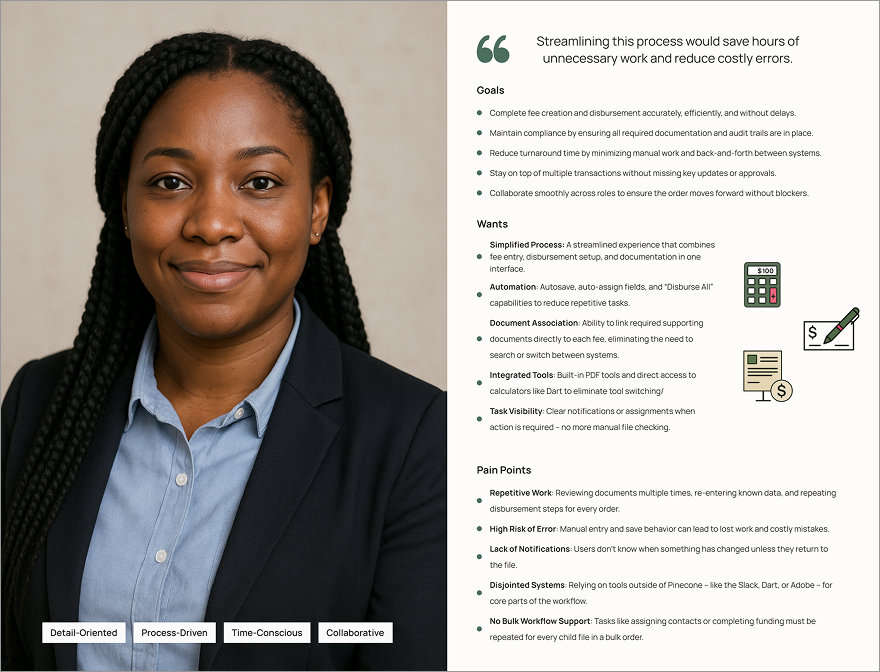
User Persona
This persona is one of the key deliverables from our contextual inquiries. It represents a combined view of closing, pre-funding, and funding associates—reflecting the company’s broader goal of consolidating roles into a more unified, streamlined workflow. It’s also effective for providing a high-level overview of user needs, goals, and pain points to guide product decisions.

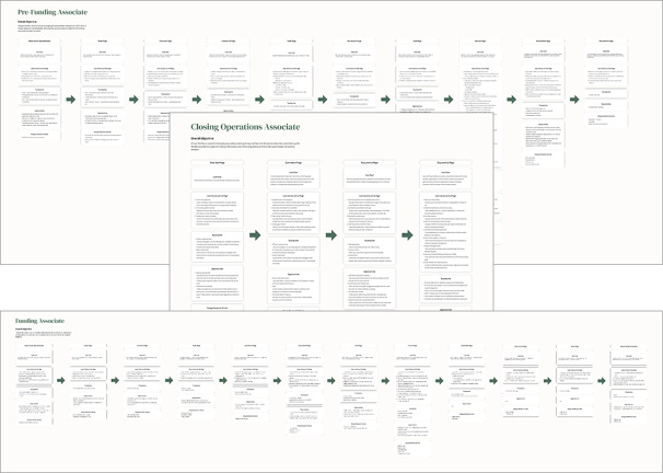
Task Analysis
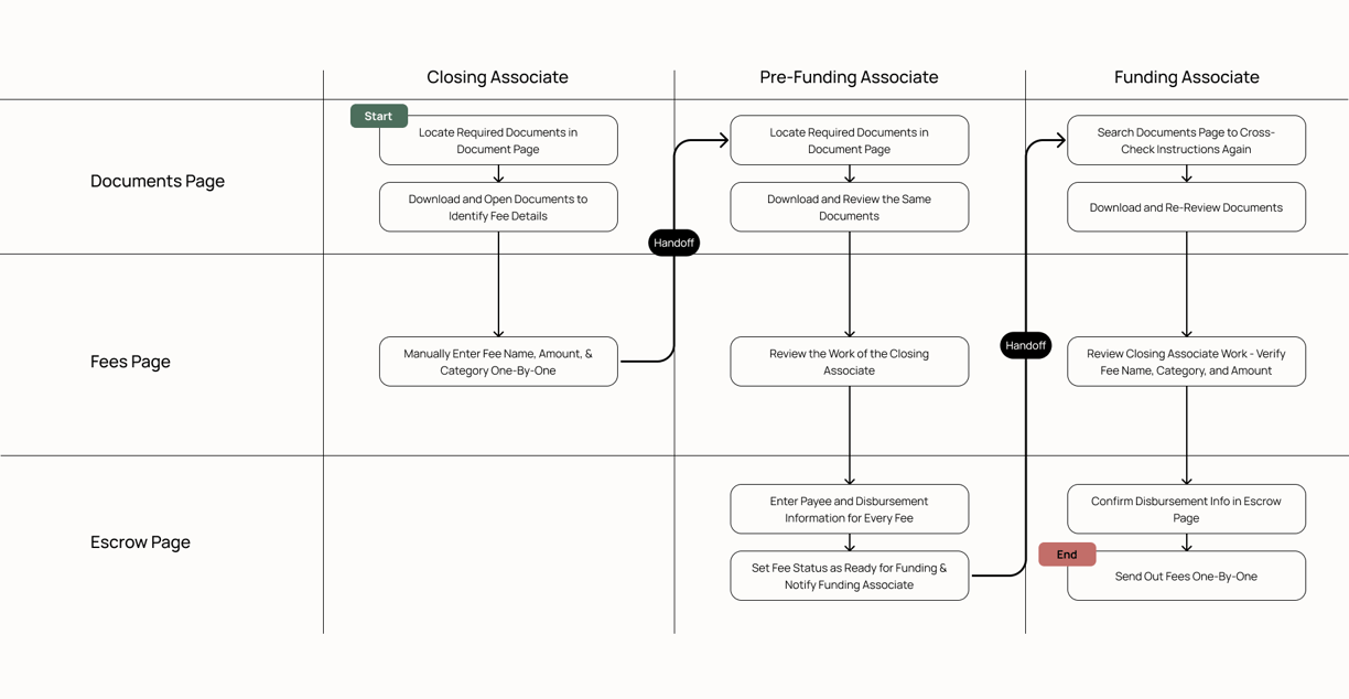
This task analysis outlines how the Fees and Escrow pages are used by Closing, Pre-Funding, and Funding Associates. It provides a detailed view of the current workflows to identify bottlenecks and inform how we can streamline them into a single, unified experience.
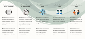
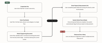
When User Frustration Becomes a Business Risk
Existing Workflow: Step-by-Step Across Teams
The New Simplified Workflow
03
Usability Testing
How We Tested the Redesign
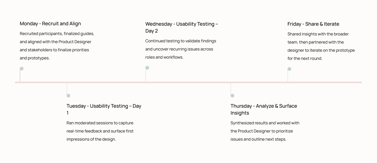
Weekly Research Cadence
01 WHAT
02 WHY
03 HOW
Ran 4 weeks of usability testing to observe how users navigated the redesigned Fees and Escrow flow.
Validate that the new design worked for real users an catch flaws early.
4-week cadence of moderated remote tests with 8-10 participants per week across roles.
04 METRICS
Tracked task time, error rate, Single Ease Question (SEQ), and System Usability Scale (SUS).
05 TASKS TESTED
Tested two core tasks: creating a fee and disbursing one or multiple fees using the new consolidated flow.
How I Captured & Organized Usability Data
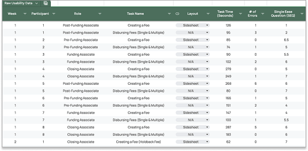
This spreadsheet logged each participant’s task performance—including time on task, SEQ scores, errors, and layout used.
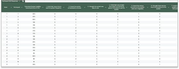
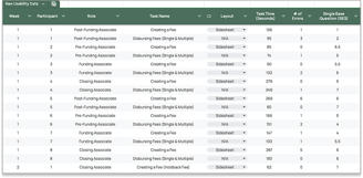
This spreadsheet captured individual ratings for the System Usability Scale, with scores auto-calculated for consistency.
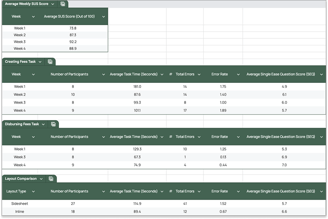
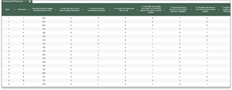
This spreadsheet pulled from both tabs to visualize trends week over week—making it easy to compare performance across tasks, layouts, and test versions.
Raw Usability Data
Participant System Usability Scale Survey Responses
Metrics Summary
To track usability progress, I maintained a structured spreadsheet with three key tabs:
Introducing the Redesign
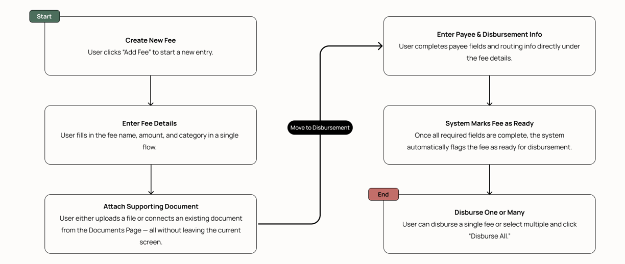
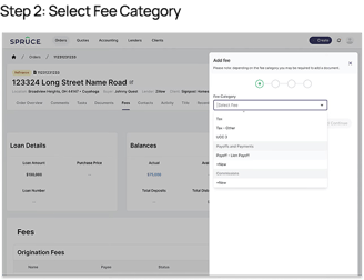
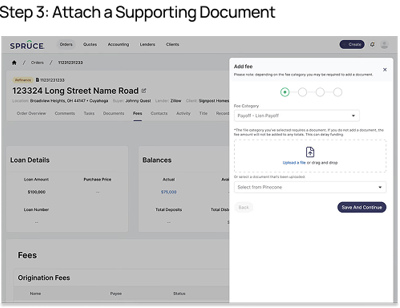
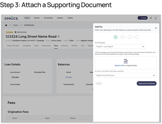
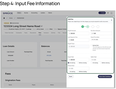
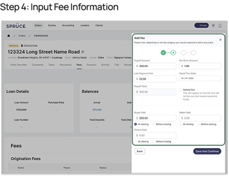
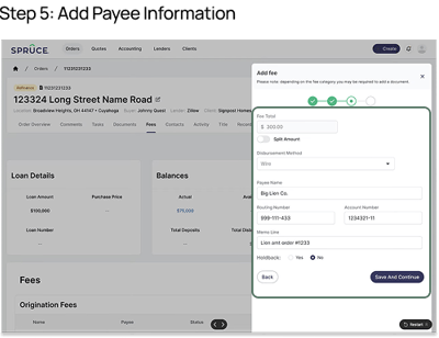
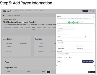
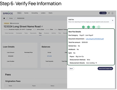
Creating Fees Workflow
Disbursing a Single Fee Workflow

Disbursing Multiple Fees Workflow
Usability Testing Recommendations
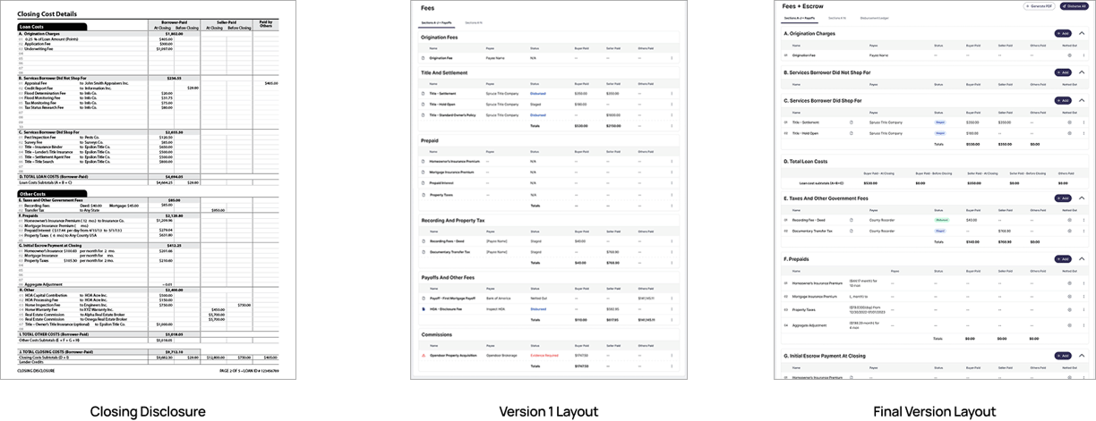
CD-Aligned Structure
The Closing Disclosure (CD) lists fees in a standardized order, and users rely on it to guide data entry in Pinecone. In Version 1, the platform’s layout didn’t match the CD, forcing users to pause, cross-reference, and second-guess where fees belonged—slowing them down and increasing the chance of error. We recommended updating the Fees & Escrow layout to follow the CD’s structure using familiar section headers like “Origination Charges.” This low-effort change made the interface more intuitive, reduced cognitive load, and helped users move faster and more confidently.
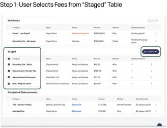
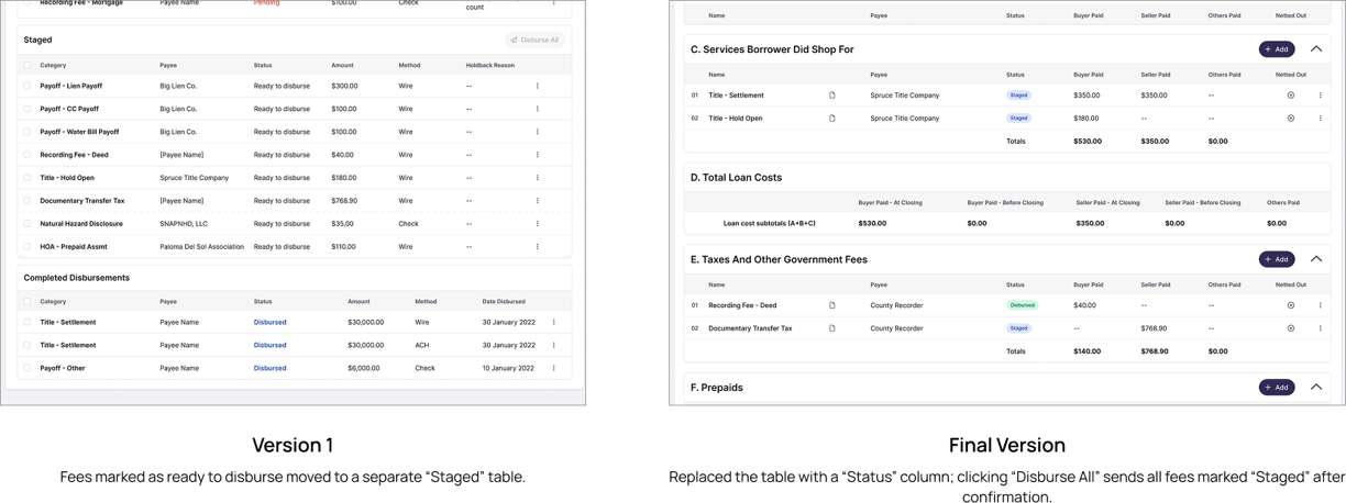
Remove "Staged" Table
The original design moved ready-to-send fees into a separate table, which confused users and broke alignment with the Closing Disclosure. We replaced it with a simple status column in the main fee table. This keeps everything in one place, maintains visibility, and makes the disbursement flow more intuitive—no extra sections to navigate.
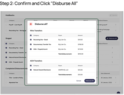
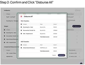
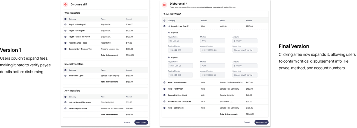
Add Disbursement Verification Check
In the original design, users couldn’t review payment details before sending funds—making it easy to miss errors. We added expandable rows in the disbursement modal so users can verify key info like payee, method, and routing numbers before clicking “Disburse All.” This small change introduced a critical verification step, reducing risk and giving users more confidence before finalizing transactions.
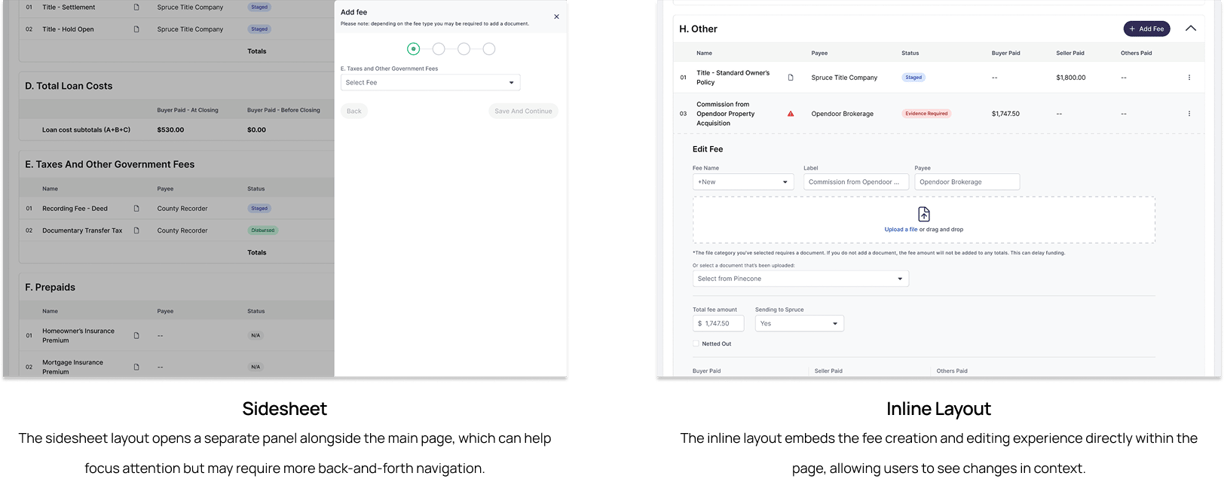
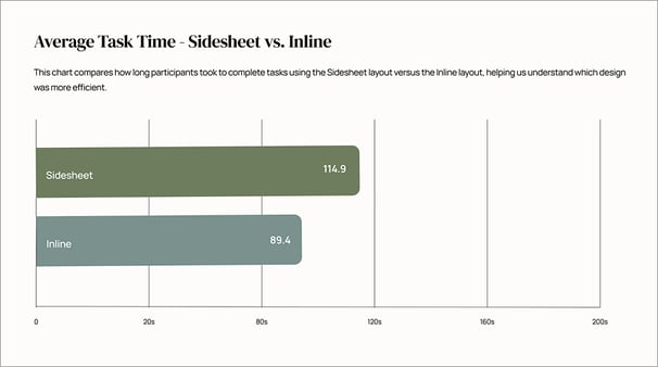
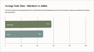
Inline vs. Sidesheet Layout
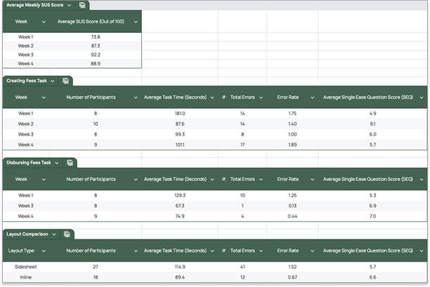
Between the two layouts we tested—inline and sidesheet—inline was the clear winner. It kept users in context, made edits faster, and reduced navigation friction. The following charts show the usability data that supported this recommendation.
What the Data Showed

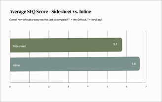
Users consistently found the inline layout easier to use than the sidesheet, citing better visibility and a more streamlined experience. SEQ scores improved from 5.7 to 6.6 — a 16% increase in perceived ease.
Average task time dropped from 114.9s to 89.4s — a 22% improvement — when using the inline layout.

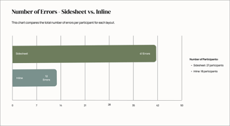
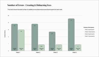
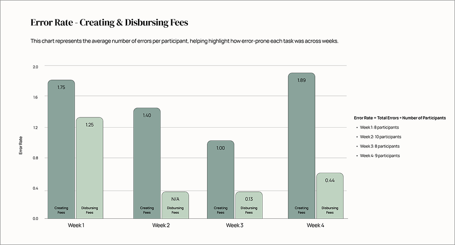
Users made significantly fewer mistakes in the inline layout, with total errors dropping from 41 in the sidesheet to just 12 in the inline—even with only 9 fewer participants tested.
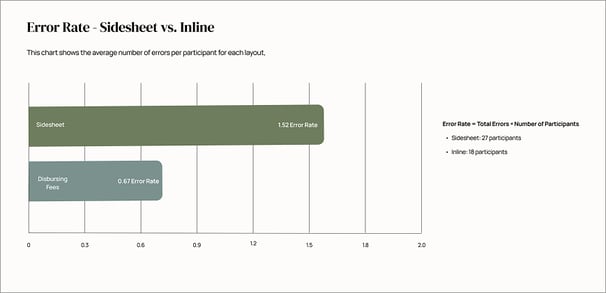
The average number of errors per participant decreased by 56%, falling from 1.52 in the sidesheet layout to 0.67 in the inline layout.
04
Final Design & Outcomes
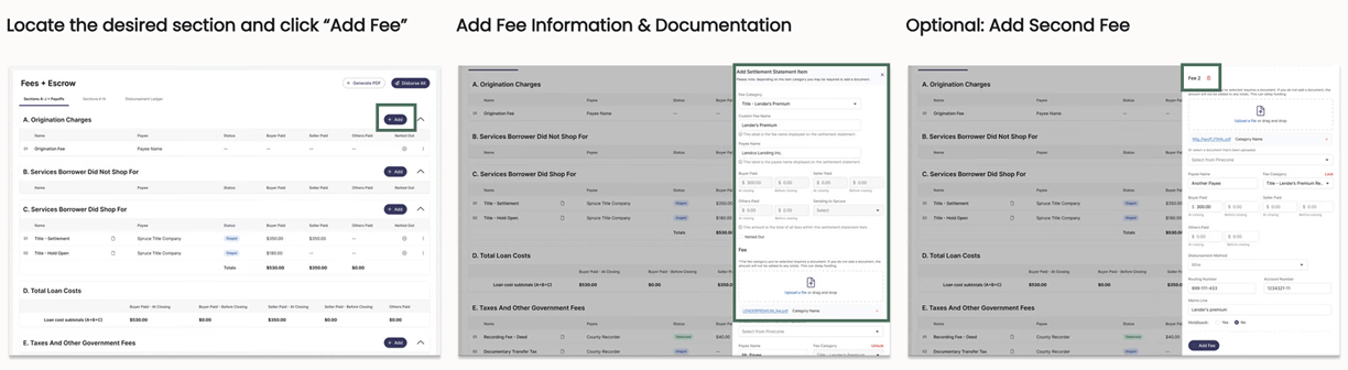

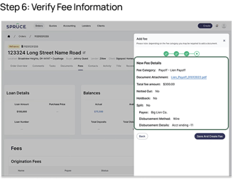
Final Fee Creation Experience
Although testing showed the inline layout was more usable, engineering had already built the sidesheet version. Rather than start over, we found a compromise. We removed pagination from the sidesheet, placing all inputs in a single scrollable view. This gave users the visibility they needed without disrupting engineering timelines. The result supported faster edits, fewer errors, and a smoother experience—while keeping long-term plans to move to inline on the roadmap.
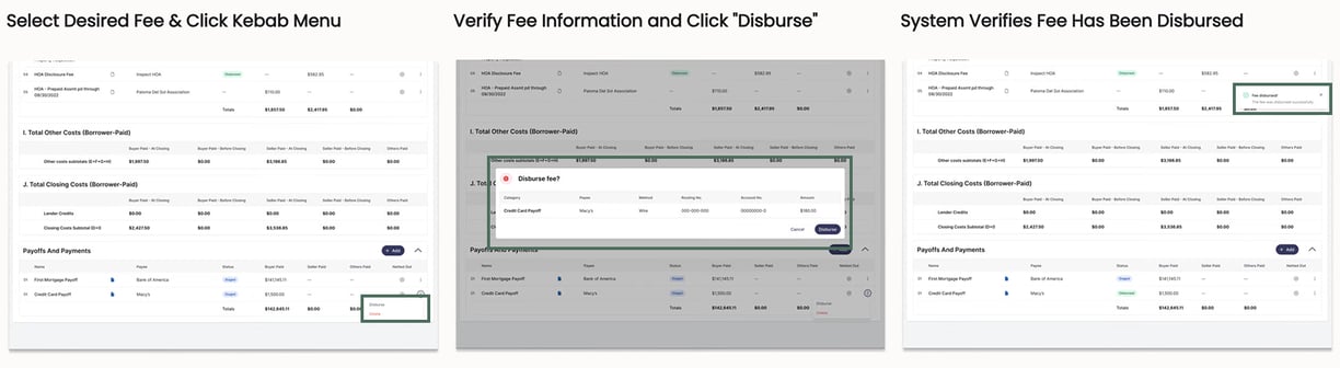
Final Disbursement Experience - Single Fee
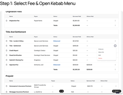
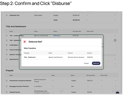
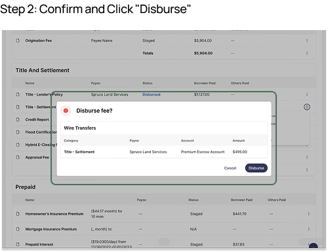
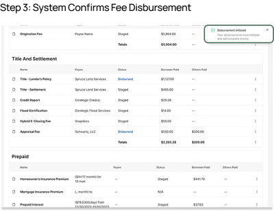
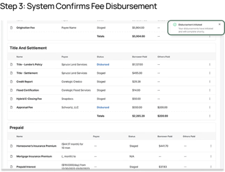
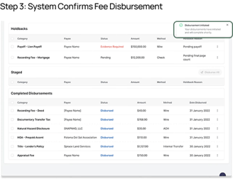
The final disbursement flow keeps things simple and secure. Users select a fee, review key routing and payee details in a confirmation modal, and disburse with a single click. Once sent, the system updates the status inline—giving immediate feedback and reducing the chance of mistakes.

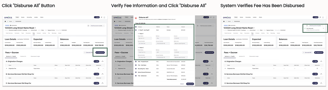
Final Disbursement Experience - Multiple Fees
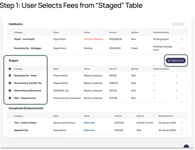
The bulk disbursement flow simplifies high-volume work. With one click, users open a modal showing all staged fees and their key details—payee, amount, and routing info. After a quick review, they confirm the disbursement and see all statuses update instantly. It’s fast, clear, and built for scale.

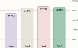
Performance Highlights
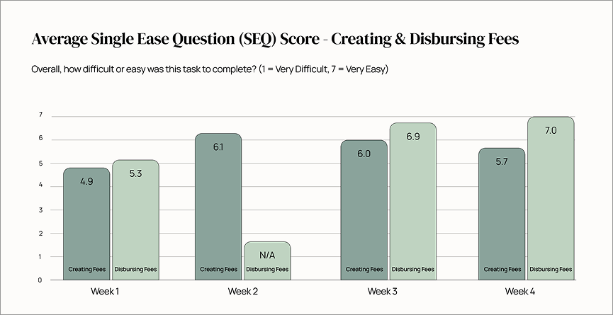
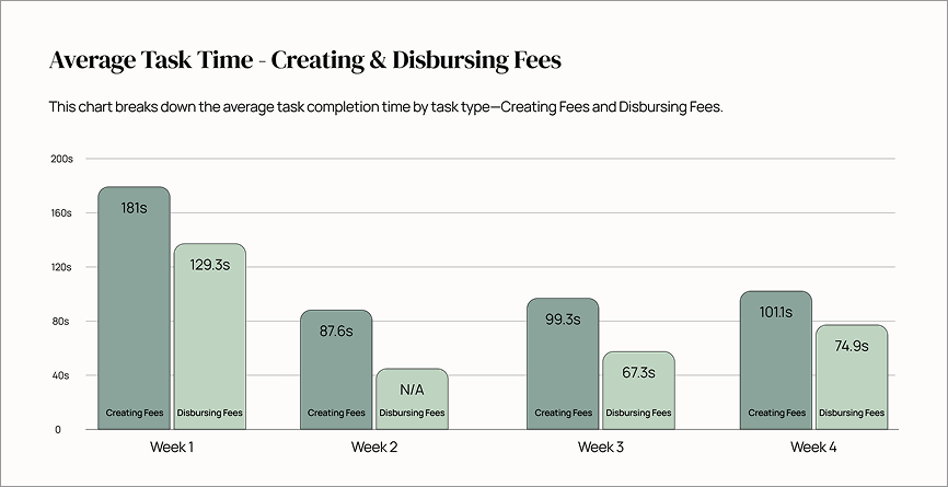
We tested iteratively across four weeks and saw clear gains. Ease-of-use scores (SEQ) climbed steadily, while task time dropped—both peaking in Week 3, when we tested the inline layout exclusively. Errors followed the same pattern, with total mistakes and error rates reaching their lowest that week. When we tested the revised sidesheet in Week 4, performance dipped slightly but still outperformed the original. Across the board, the data showed that the inline layout delivered the best results.


Exceeding Goals, Enabling Strategy
By the end of testing, SUS scores rose from 73.8% to 92.2%, with the final design holding strong at 88.9%. Beyond improving usability, we delivered real operational value—streamlining workflows, reducing friction, and introducing critical features like document association, bulk disbursement, and support for complex fee types. These changes made the system faster, more accurate, and easier to scale—directly supporting the company’s goals.