

AppGrooves
Cutting Through the Clutter: How Smart UX Boosted Redemption Rates
AppGrooves is an app discovery company specializing in ranking and reviewing over 7 million apps to help users find the best product that matches their needs and save money at the same time.This feature was built to allow users to easily compare deal offerings across multiple shopping categories, helping them find the best discounts and save money.
In the competitive cashback space, AppGrooves introduced a deal comparison feature to help users quickly find and redeem the best offers across brands and categories—aiming to boost engagement and compete with players like Rakuten.
Date
Role
UX Researcher and Designer
About the Project
June 2020 to August 2020
Stakeholders
CEO, Marketing Manager, Engineering Manager, Product Designer, UI Designer
Methodology
User Surveys
Focus Group
Remote Moderated Usability Testing
Introduction
AppGrooves aimed to grow its presence in the competitive shopping and cashback space by launching a Deal Comparison feature—a move designed to both engage users and unlock new revenue opportunities from its subscriber base.
Business Case
Research Approach
To inform design and ensure we built the right experience, I led a two-phase research initiative:
01
The strategic objectives was to:
✅ Drive user traffic and engagement to partner apps
✅ Increase redemption behavior to prove user value
✅ Attract major partnerships by demonstrating performance metrics
To secure buy-in from potential partners, we set a target Click-Through-to-Redeem Rate (CTR-B%) of 50%—a benchmark that would showcase the feature’s ability to drive conversions at scale.
Phase 1 → Generative Research
User surveys to validate deal discovery habits and interest in a comparison tool.
6-person focus group to define MVP must-haves and uncover expectations.
Phase 2 → Iterative Usability Testing
Weekly moderated sessions to test new designs.
Redemption data tracked across versions to guide improvement.
Findings used to remove friction and improve the user flow.
02
Foundational Insights
What We Did
We conducted a two-part generative research study to validate the need for a Deal Comparison feature and define MVP requirements.
Survey - 100 Participants
Recruited from engaged subscribers of the website.
Assessed deal discovery habits (apps used, frequency, category interest).
Gauged perceived value of a centralized comparison experience.
Focus Groups -- 2 sessions, 6 users each (12 total)
60-minute moderated sessions via Zoom.
Explored what users would want to see in a tool like this -- features, expectations, and must-haves.

Survey Findings
Focus Group Takeaways: How Users Really Want to Find Deals
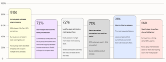
Here are some of the most impactful insights from the survey. These findings helped define what mattered most to users — from how they find deals, to the features they expect in a comparison tool.
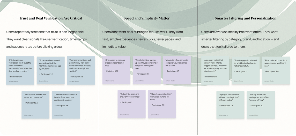
These were the three clearest takeaways from our focus groups. Users told us exactly what they wanted: real signals they could trust, a simpler experience with fewer steps, and deals that actually felt relevant. The quotes below helped shape our early design principles.
Our User & Their Needs
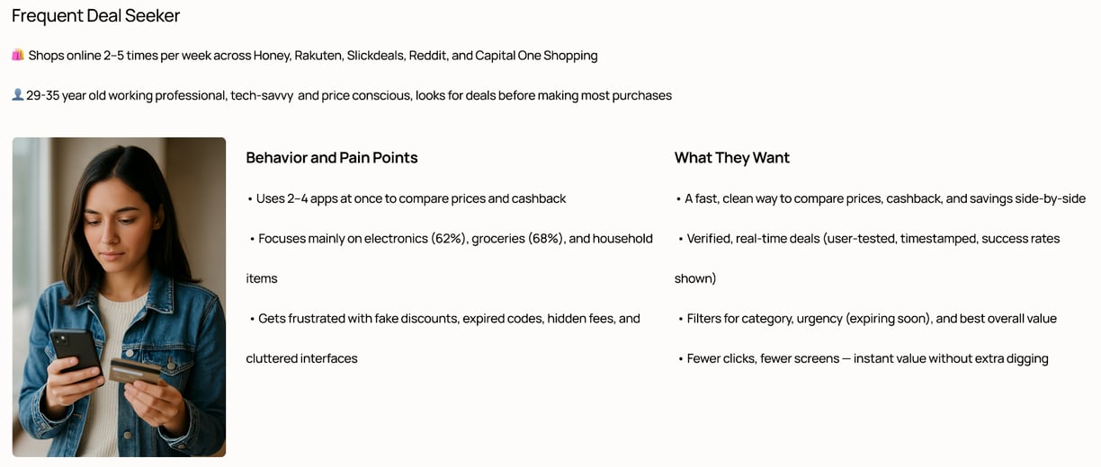
Here’s a snapshot of our core user. This persona represents the people who shop online multiple times a week and actively look for deals. Their behavior, frustrations, and goals helped us stay grounded in real needs throughout the design process.

03
Design Iteration & Testing
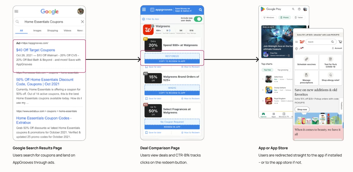
This is the core flow we were optimizing. Users land on our site from a Google search, explore the Deal Comparison page, and then redeem through an app or the app store. Every version we tested kept this structure — the changes focused on what users saw and did in the middle step.
How We Ran Usability Testing
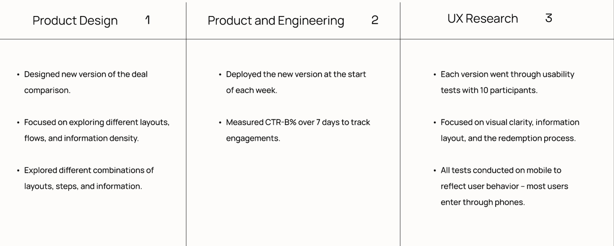
This table shows how Product Design, Engineering, and UX Research worked together in parallel during testing. Each team had a focused role: Design iterated weekly on layouts and flows, Engineering shipped updates and tracked CTR-B%, and Research tested every version with users to uncover friction points. These fast cycles helped us learn quickly and validate changes in real time.
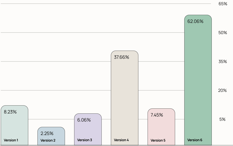
Version-by-Version: What Worked, What Didn't
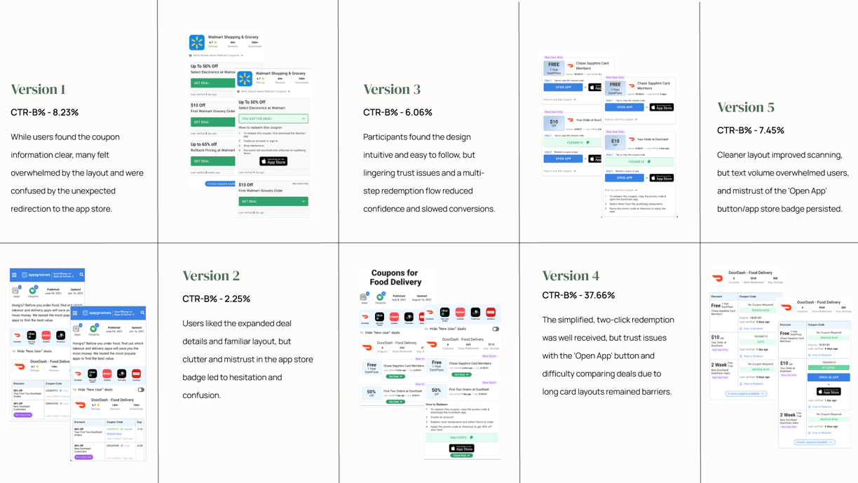


Here’s a snapshot of what we tested and learned across all five versions. Each iteration explored different combinations of layout, copy, and flow — with usability feedback and CTR-B% helping us understand what was working and what wasn’t. These findings directly shaped the final version.
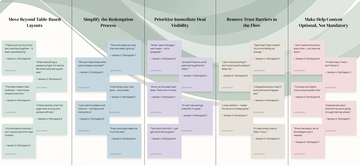
Understanding User Pain Points Across Versions
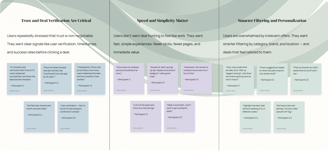
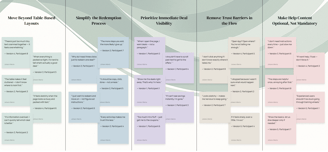
To understand what was getting in the way of a smooth experience, I pulled the most impactful quotes from usability testing and grouped them into key themes. These patterns helped surface the recurring pain points across all design versions — from overwhelming layouts and confusing flows, to trust barriers and forced steps users didn’t want. This gave us a clear direction on what needed fixing.
Paths to Redeeming a Deal
04
Final Design & Outcome
Version 6: The Breakthrough Design
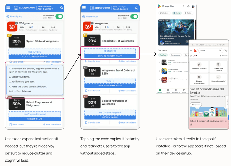

Removed the intro paragraph
→ Users now see deals immediately
Instructions made optional
→ Reduced clutter, faster flow
One-click copy + redirect
→ Eliminated 3-step redemption process
No more "Open App" or app storage badge
→ Single transparent CTA builds trust
Scannable information
→ Easier to scan & compare deals side-by-side
Exceeding Goals, Enabling Strategy
The success of Version 6, backed by a 62.06% CTR-B%, provided the CEO with clear, data-driven validation that the Deal Comparison feature was working.
With this breakthrough, leadership finally had the confidence—and the proof—they needed to begin approaching app companies with a strong case for partnership.